

MTG Proxy Quality, Print Fidelity and Buying Guides
Compare print fidelity, cardstock, cutting, finish, sleeve feel, and order consistency before choosing proxies for decks or Cubes.
MTG Proxy Quality, Print Fidelity and Buying Guides
MTG proxy quality is not defined by one dramatic feature. It comes from how color, fine text, black density, cardstock, finish, cutting and alignment work together on a physical card. A card can look convincing in an image yet feel wrong in a deck because its corners, stiffness or surface response differ from the cards around it. Proxy-King covers these practical details for players building readable playtest cards, polished Commander decks, consistent Cubes and deliberate tabletop presentations.
The useful question is not simply whether a proxy looks good at arm’s length. It is whether the card remains sharp under ordinary lighting, fits a sleeve cleanly, shuffles without drawing attention and stays consistent across a full order. This publication separates meaningful production differences from cosmetic trivia, explains where artwork and file preparation affect the result, and compares options around the project at hand rather than treating every premium-sounding specification as an automatic upgrade.
Where to Start
If you are new to proxies, start with MTG Proxies and Buying Guides to define the quality level your project needs. Move to Proxy Printing before preparing artwork or placing an order, especially when bleed, color handling and file setup could affect the final cut. If physical feel is the priority, begin with Cardstock & Finishing and Proxy Quality & Realism, where sleeve compatibility, corner shape, centering, glare and small-text clarity provide a more useful basis for judgment than a single advertised specification.
For a vendor decision, turn to Reviews & Comparisons only after fixing the quantity, configuration and intended use. One showcase card, a complete Commander deck and a 720-card Cube create different demands for consistency, workflow and total cost. Commander & Deck Testing helps frame cards around the questions a deck needs to answer, while Cube & Bulk Orders focuses on larger projects, where repeated cutting drift, mismatched finishes or inefficient list preparation can matter more than a minor difference on one card. Start with the project type, then compare quality and value on equivalent terms.
Latest from Proxy-King

Gloss, Matte, and Satin Proxy Finishes: Which One Looks Most Like a Premium Card?
Satin is usually the safest premium-looking proxy finish, but gloss gives colors more punch and matte controls glare better. Here is how each behaves in play.
Read more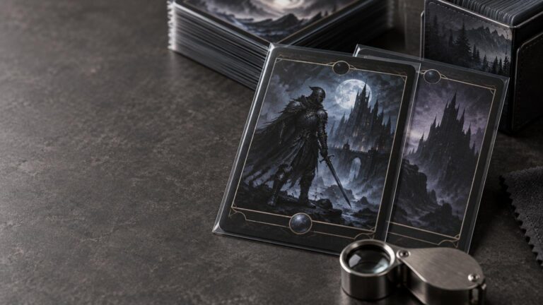
Black Levels on MTG Proxies: Why Dark Cards Reveal Weak Printing Fast
Dark MTG cards make excellent print-quality tests because they expose crushed shadows, weak contrast, uneven black fields, rough gradients, and soft text at once.
Read more
Proxy Corner Radius and Edge Finish: The Tiny Details That Make a Deck Feel Cheap or Premium
A close look at the small finishing defects that separate polished MTG proxies from cards that snag sleeves, shed fibers or make a squared deck feel inconsistent.
Read moreJudge the Complete Card, Not One Specification
Resolution, cardstock labels and finish names matter only when they improve the card in use. A sound buying decision accounts for artwork requirements, readability, cut consistency, sleeve behavior, order size and the role the deck will play. Quick testing may call for a simple home-printing workflow, while a finalized Commander deck or large Cube can justify closer attention to production consistency. Proxy-King covers the differences worth scrutinizing, the upgrades that fit particular projects and the imperfections unlikely to matter during ordinary play.